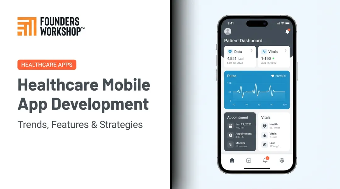
This guide is for founders, product teams, and entrepreneurs building or commissioning digital health products — patient portals, telehealth platforms, EHR tools, clinical dashboards, wellness apps. It covers the core challenges that make healthcare UX genuinely difficult, the practices that actually prevent failures, and the innovations reshaping what's possible.
Key Takeaways
- Healthcare UI/UX errors directly affect patient safety — not just user satisfaction.
- Documented EHR usability failures have contributed to measurable patient harm across millions of safety reports.
- Core best practices: user research with real clinicians, accessibility as a baseline, simplified information architecture, and iterative testing.
- Emerging innovations — AI interfaces, telehealth UX, ambient documentation, and aging-population design — are redefining what effective healthcare software requires.
- Design and development must run in parallel on healthcare projects, not in sequence.
Why Healthcare UI/UX Carries Higher Stakes
Healthcare software has a unique failure mode: the interface itself becomes a clinical risk.
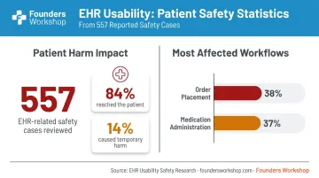
A 2018 JAMA study analyzing 1.735 million patient safety reports found 557 cases where EHR usability explicitly contributed to possible patient harm. Of those, 84% reached the patient and required monitoring, and 14% caused temporary harm. The most affected workflows? Order placement (38% of cases) and medication administration (37%).
A separate Joint Commission Journal analysis of 849 medication-related safety events found that electronic medication administration record (eMAR) usability issues — particularly visual clutter in the display — contributed to 473 incidents. Display problems were a secondary factor in 69% of eMAR-related errors.
The efficiency gains from getting it right are just as measurable. A 2021 JAMIA Open study found that targeted EHR optimization reduced time spent in the system by more than 6 hours per clinic per day, saving individual clinicians an average of 20 minutes daily.
Why Healthcare UX Lagged Behind Other Industries
For decades, healthcare software operated in a low-competition, high-demand environment where usability was optional. Regulatory burden, long product cycles, and captive customer bases all reduced the pressure to prioritize user experience.
COVID-19 broke that pattern quickly. McKinsey reported that virtual care adoption reached 14–17% of visits by 2023, compared to roughly 1% in February 2020. Patients now expect consumer-grade digital experiences from their providers — and products that can't deliver are losing users to those that can.
Core Challenges in Healthcare UI/UX Design
Compliance Without Killing Usability
HIPAA, HITECH, and related regulations create real design constraints — consent flows, role-based access controls, PHI display rules, session management, audit trails. The mistake is treating these as bolt-on requirements rather than design elements.
When compliance features are poorly implemented, they become friction: consent forms that bury key information in legal language, session timeouts that log clinicians out mid-task, authentication prompts that interrupt workflows at the worst moments.
Designed with care, those same features become trust signals. A well-designed consent flow with plain-language summaries and clear opt-in steps can improve completion rates while meeting legal requirements. Session timeout warnings with a visible countdown and one-click resume feel manageable rather than obstructive.
Designing for Multiple User Types
A telehealth platform serves at least four distinct user types, each with different cognitive priorities and definitions of "fast":
- Patients scheduling appointments and reviewing instructions
- Physicians reviewing records and making clinical decisions
- Nurses updating charts in real time across multiple patients
- Admins managing billing, scheduling, and access permissions
Forcing them all through the same interface leads to cognitive overload and workflow errors. Effective healthcare UX requires role-specific navigation, distinct dashboard hierarchies, and access permissions that feel like context-switching rather than locked doors.
Accessibility Across Diverse Populations
The National Assessment of Adult Literacy found that only 12% of U.S. adults have proficient health literacy, while 36% fall in the basic or below-basic categories — roughly 77 million people. That same group uses the internet for health purposes at dramatically lower rates: 20% versus 62% among proficient readers.
Healthcare accessibility goes beyond WCAG compliance. It requires:
- Plain-language error messages (not medical jargon)
- Progressive disclosure of complex clinical information
- High-contrast data visualizations readable under poor lighting
- Larger tap targets for users wearing gloves or managing tremors
- Simplified navigation for elderly users or those under cognitive stress
Managing Cognitive Load in Clinical Environments
Clinicians work in interrupt-heavy environments — context-switching between patients, managing alerts, completing documentation under time pressure. Dense menu structures, redundant data entry, and unclear visual hierarchies make that worse.
Healthcare UX must be designed for error prevention, not error correction. A physician who selects the wrong patient from a list with poor visual differentiation doesn't get a second chance to review a critical alert. Dense data views need to be scannable rather than comprehensive: structured to surface the most critical information at the moment it's needed, not after a clinician has already moved on.
Security-Usability Tradeoff
Multi-factor authentication, automatic logouts, and data masking are necessary. They're also friction-heavy in fast-moving clinical environments where a nurse may log in dozens of times per shift.
Contextual security design resolves most of this tension. Practical approaches include:
- Proximity-based authentication that recognizes a clinician's device or badge without requiring manual re-entry
- Smart PHI masking that hides identifiers in summary views but surfaces them on demand
- Risk-based session management where timeout duration scales with access level rather than applying a single blanket rule
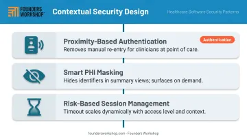
Each approach keeps security intact while cutting the repetitive interruptions that slow clinical workflows.
Healthcare UI/UX Best Practices That Actually Work
Start with User Research, Not Assumptions
Healthcare UX assumptions fail in specific, predictable ways. Product teams assume clinicians want comprehensive data — then discover they want the three most critical fields, fast. They assume patients want full control — then discover they want guidance.
A 2019 JMIR participatory co-design study with 361 cancer patients illustrates what research reveals. Researchers discovered that 65.7% of patients used smartphones, with most preferring immediate access to all medical data. More practically: focus group feedback showed that a standard "hamburger" menu navigation pattern was non-intuitive for this population — leading the team to replace it with a tab-based menu that performed better in usability testing.
A fundamental navigation change — caught before launch, not after.
Simplicity as a Safety Feature
In healthcare, removing steps is not an aesthetic preference — it's a patient safety decision. An unnecessary click in a medication administration workflow is an opportunity for a wrong selection. A cluttered order entry screen increases the probability of error.
The eMAR data cited above makes this concrete: display clutter was a contributing factor in the majority of eMAR-related medication errors. Simplification is harm reduction.
Best practices for simplicity in clinical interfaces:
- Remove features used by fewer than 10% of users to secondary menus
- Provide clear, single-action calls to action for high-frequency tasks
- Use progressive disclosure to hide complexity until it's needed
- Design confirmation dialogs only where the consequence of error is severe
Accessible Design as a Baseline
WCAG AA compliance is the floor, not the goal. In healthcare, the realistic user population includes elderly patients with limited digital literacy, clinicians using touchscreens with gloves, people accessing portals under physical or emotional stress, and users on older mobile devices with small screens.
Practical baseline requirements:
- Minimum 44px touch targets on mobile interfaces
- Text size adjustable without breaking layout
- Color never used as the sole indicator of status or severity
- Icon labels present (never icon-only navigation for primary functions)
- Error messages that explain what to do, not just what went wrong
Iterative Prototyping and Usability Testing
Low-fidelity wireframes shown to real users early are worth more than polished mockups shown to stakeholders late. Catching a critical navigation problem in a paper prototype costs a conversation. Catching it post-launch costs a redesign — potentially including regulatory review.
Usability testing in healthcare should use scenario-based tasks that mirror real workflows — not "find the settings menu," but "a patient is asking about their recent lab results; show me how you'd locate and share them." The tasks need to match the cognitive context of actual use.
Key principles for effective healthcare usability testing:
- Test with representative users (clinicians, patients, admins — not internal stakeholders)
- Use scenario tasks that reflect real clinical or patient workflows
- Recruit across experience levels, including low digital literacy users
- Run sessions early enough that findings can change the design
Founders Workshop's Definition phase builds this in — clickable prototypes are developed before development begins, allowing stakeholders to validate flows and catch problems when they're still cheap to fix.
Design Systems and Role-Specific Patterns
Healthcare products often span web dashboards, mobile apps, and embedded device interfaces. Without a shared design system, visual inconsistency accumulates — and in healthcare, inconsistency erodes the trust and predictability that clinicians depend on.
Role-specific patterns matter as much as consistency:
| User Role | Interface Priority |
|---|---|
| Clinician dashboard | Speed, data density, keyboard efficiency |
| Patient-facing app | Clarity, guided flows, reassurance |
| Admin interface | Data completeness, bulk actions, filtering |
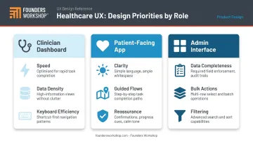
Defining these differences in persona and journey map work — before any visual design begins — prevents feature bloat and avoids the single-experience-for-all failure mode.
Emerging Innovations Shaping Healthcare UI/UX
AI-Powered Interfaces and Clinical Decision Support
AI is changing healthcare interfaces at multiple levels: predictive form-filling in EHRs, smart search that surfaces relevant patient history, AI-assisted triage in telehealth platforms, and clinical decision support that delivers relevant alerts at the point of care.
An NBER working paper estimates wider AI adoption could reduce U.S. healthcare spending by $200–360 billion annually — driven largely by administrative efficiency and clinical workflow improvements.
The UX challenge specific to AI in healthcare is explainability. A clinician who receives an AI-generated recommendation and doesn't understand why it was made is unlikely to trust it consistently. They may also override it without evaluating it at all. Good AI UX in clinical settings makes the reasoning visible, allows confident override, and logs decisions for audit purposes.
Telehealth and Remote Care UX
Medicare FFS beneficiaries used 52.7 million telehealth visits in 2020 — a 63-fold increase from 2019. Usage stabilized but remained dramatically elevated post-pandemic, with virtual care at 14–17% of all visits by 2023.
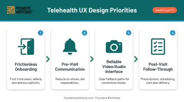
Telehealth UX standards are still catching up to that scale. Key design priorities:
- Frictionless onboarding for first-time users who may be elderly or anxious
- Pre-visit communication flows that reduce no-shows and set expectations clearly
- Reliable video/audio interfaces with clear fallback paths when connections degrade
- Post-visit follow-through — prescription management, follow-up scheduling, care plan delivery — built into the same experience
Designing for an Aging Population
Older adults are also the fastest-growing telehealth segment — which makes age-inclusive design a direct extension of the priorities above. By 2034, the U.S. Census Bureau projects adults 65+ will outnumber children under 18. 43.3% of adults over 65 used telemedicine in 2021 — the highest rate among adult age groups. Yet 56.5% of those users used audio-only, suggesting that video interfaces remained too complex for a significant share of that population.
Patient portal adoption among adults 50–80 reached 78% in 2023, but only 57% felt confident navigating their portal. That gap between access and competence is a design problem.
Aging-specific design is mainstream product strategy, not a niche accommodation:
- Larger text that scales without breaking layouts
- Reduced reliance on icon-only navigation
- Lower cognitive task complexity per screen
- Multimodal input options (voice, large-button alternatives)
- Clear session state indicators so users know where they are
Voice Interfaces and Ambient Documentation
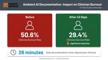
Ambient AI documentation has crossed from pilot programs into active clinical use. A 2025 study at Mass General Brigham found clinician burnout dropped from 50.6% to 29.4% over 42 days among ambient documentation users. A separate 2025 study reported daily documentation time decreased by 26 minutes for early implementers.
The UX requirements for voice-driven clinical tools are distinctly different from screen-based interfaces:
- Confirmation flows that don't disrupt clinical conversations
- Clear error recovery via voice ("undo last entry," "what did you capture?")
- Privacy-safe ambient listening with explicit on/off controls visible to patients
- Summary review screens that allow rapid correction before records are saved
Design + Development: Why Both Need to Be Aligned in Healthcare Software
The most common failure mode in healthcare software projects isn't bad design or bad code — it's the handoff between them.
Design completes a full UX specification. Development reviews it and finds problems nobody caught earlier:
- A critical flow assumes an EHR integration that doesn't exist in the target API
- A PHI masking pattern requires a database architecture change
- Session management design conflicts with existing authentication infrastructure
The team backtracks. Timelines slip. Rework happens during the most expensive phase.
In healthcare, this problem is worse than in other industries because the additional layers — regulatory review, accessibility compliance, EHR/EMR integration constraints — all interact with each other. A late-stage accessibility audit that finds WCAG failures requires both design and development changes. A compliance review that identifies a consent flow gap may require database schema changes, not just UI updates.
The fix is treating design and development as a single collaborative track from day one. Design decisions get validated for technical feasibility before they're finalized — developers review UX flows in working sessions, not post-handoff, and the team iterates on functional prototypes rather than static mockups.
That's exactly how Founders Workshop's 5D Process is structured. The Definition phase brings designers and technical leads together to define both the interface and the architecture — producing wireframes, clickable prototypes, and the technology stack in the same four-to-six week window. By the time Development begins, there are no surprises on either side.
Healthcare startups and SMBs that build design and development in silos reliably end up with the same problems: feature bloat, accessibility gaps caught too late, and HIPAA-related rework that delays launch and inflates cost. Working with a partner who runs both disciplines inside a single accountable process means those problems surface in week two — not week sixteen.
Frequently Asked Questions
What makes healthcare UI/UX design different from standard UX design?
Healthcare UX operates under higher stakes — interface failures can contribute to medication errors, missed diagnoses, or patient harm — and stricter constraints including HIPAA compliance, role-based access requirements, and diverse user populations ranging from elderly patients to time-pressured clinicians. Unlike consumer apps built around engagement, healthcare interfaces are built around safety and clarity.
What are the most critical best practices for healthcare app design?
Start with user research involving real clinicians and patients, not assumptions. Treat accessibility as a baseline requirement, not a final checklist item. Reduce information architecture to only what the user needs at each step — complexity adds error risk. Test with scenario-based usability tasks throughout the design process, not just before launch.
How does HIPAA compliance affect UI/UX design decisions?
HIPAA doesn't prescribe visual design, but it shapes decisions around consent flow structure, role-based access controls, PHI display rules, session timeout behavior, and audit trail visibility. Each of these must be designed to maintain compliance without creating friction that breaks clinical workflows or reduces form completion rates.
What are the biggest challenges in healthcare UX design?
Four challenges come up consistently across healthcare UX projects:
- Designing distinct experiences for multiple user roles within one system
- Managing cognitive load in high-pressure clinical environments
- Balancing security requirements with the speed demands of clinical workflows
- Meeting accessibility needs for aging and varied user populations
What role does AI play in modern healthcare UI/UX?
AI enables smarter input prediction, clinical decision support, and ambient documentation tools that reduce administrative burden. The core UX challenge is trust and explainability — clinicians need to understand why a recommendation was generated and feel confident overriding it when their judgment differs. AI interfaces that obscure their reasoning get ignored or bypassed.
How do you design healthcare software for both patients and clinicians effectively?
Patient-facing interfaces should prioritize clarity, guided task flows, and reassurance — users are often anxious and unfamiliar with medical terminology. Clinician-facing interfaces should prioritize speed, data density, and keyboard efficiency. A shared design system keeps both consistent even where interaction patterns diverge.